EarthScan - Branding
& Website Redesign
Overview
EarthScan is a SaaS platform developed by Mitiga Solutions to help businesses assess and manage climate risk. I led the redesign of the brand and website to improve engagement, unify design across product and marketing, and support business growth.
Challenge
The existing brand lacked clarity and coherence, and the website had poor structure, making it difficult to communicate EarthScan’s value to clients. The sales team needed a stronger online presence to support their outreach efforts.
Approach
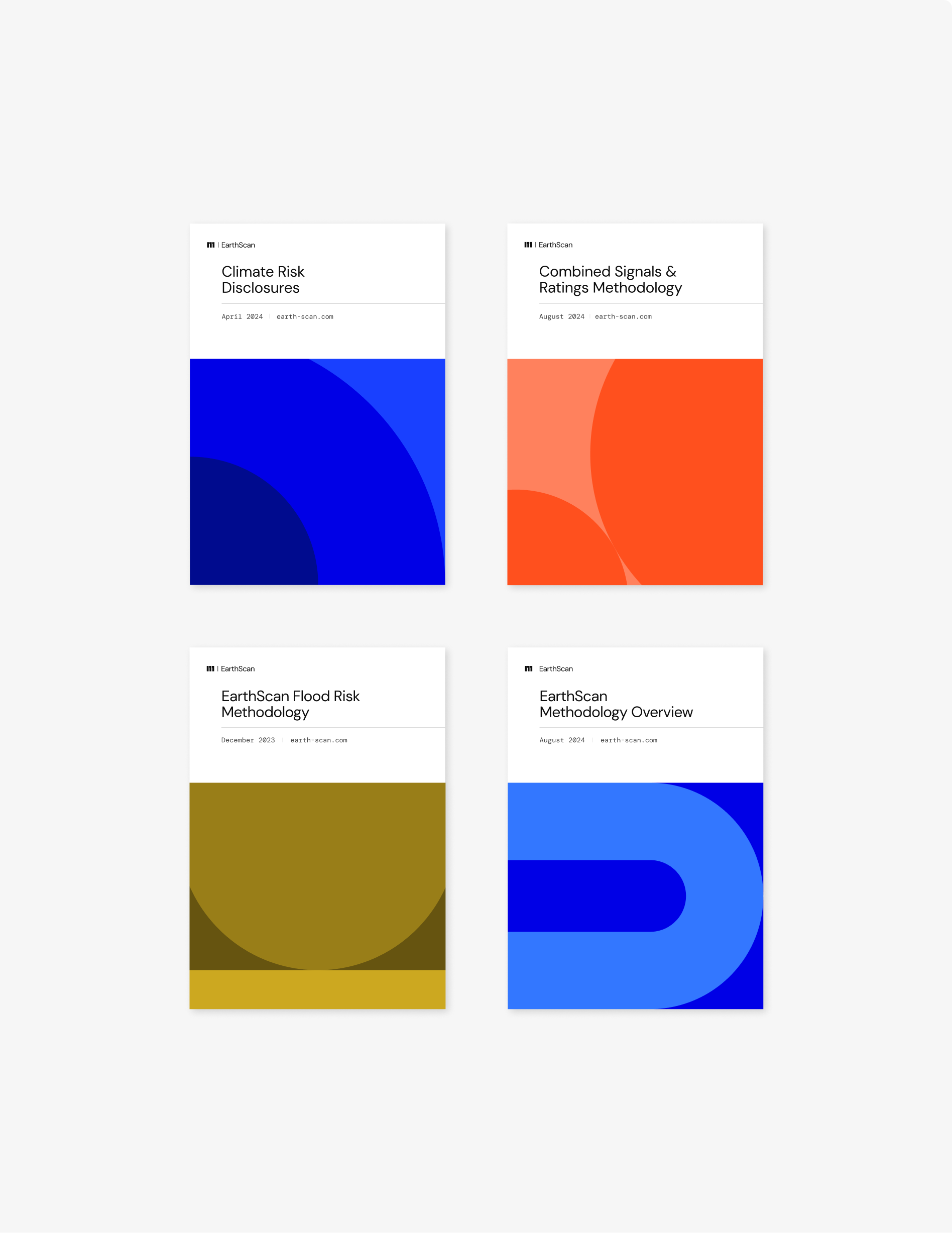
Developed a cohesive visual identity system aligned with the platform’s UI
Restructured the information architecture for clarity and user flow
Designed the new website in Figma and built it in Webflow
Created custom CMS structures for dynamic, scalable content
Produced supporting assets, including landing pages, email templates, and animated ads
Outcome
Improved stakeholder engagement and lead generation
Aligned the website with product visuals and messaging
Enabled the team to manage content in-house with minimal training